KFC US: USER RESEARCH & UX REFACTORING
Role: UX Manager & Lead Product Designer
Collaborations: Product Owners, Business Analysts, Developers
Duration: 8 months (January 2023-August 2023)
Core Responsibilities: Lead a design team of 2 product designers and 1 researcher. Conduct product strategy, conduct user research, plan implementation phase agile design sprints, and create high-fidelity prototype.
Devices: Mobile App, Responsive Website
Tools: Figma, Miro, Maze

overview
From ideation to full end-to-end agile implementation, we helped drive significant outcomes with a 89.2% rise in checkout conversion rates across all platforms in comparison to the previous year. This extensive rise in conversion was due to combined efforts across teams with KFC marketing efforts, our engineering work to decrease bugs and loading times alongside our UX refactoring improving drop-off rates across various parts of the ordering funnel.
The results
89.2%
Increase in Conversion
22.7%
Increase in Total Sessions
62.9%
Increase in Revenue
Selecting A Location
Before

Turning on geolocation was not intuitive because hidden in the location icon in search bar and the map view was difficult to navigate.
After

Easier to switch between pickup and delivery option and made it easier to turn on location services.

Ability to favorite locations and more effectively display important information like store not accepting order

Improve layout of list and map store views.
Menu Page
Before

Difficult to view menu items because of both horizontal and vertical scroll.
After

Created a tiered menu structure, added search function, and show selected store information.

Reduced the need to scroll by creating category pages and listing items vertically on page.
PDP Page
Before

Too much screen real estate to images hiding important details beneath scroll
After

Reduce main image size to reduce need for scroll and show more details above fold
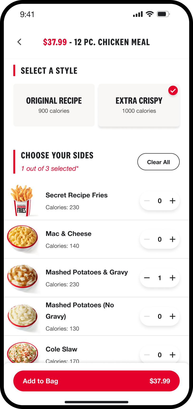
Make selecting and editing multiple sides easier and also improve UX to be scalable to allow for upsells in the future

Utilize best-in-class design practices like sliders in mobile app to allow for easier navigation

Difficult to select multiple sides and sauces
Order Confirmation
Before

The important information, like steps in progress bar or how to pick-up, is hidden
After

Reduce need for scroll and create a more detailed progress bar to allow for better understanding of the process

Make pickup instructions visible and easy to understand and make the support option more visible
Home Page
*This feature was proposed designed but not implemented due to scope and budget
Before

The home page gives too much real estate to a promo and has no other content except to promote specials
After

Use the home page to promote the loyalty program and encourage users to sign up

If the user is logged in, show them information based on their loyalty status

Allow users to easily view recent orders to make their ordering experience more streamlined when returning
PDP UPsell
*This feature was proposed designed but not implemented due to scope and budget
Before

The design of the side selection in the old app limited the scalability of the product by making it difficult for KFC to integrate an upsell function if users want a larger size of a side or beverage.
After

The new design that we implemented for KFC on the PDP would allow them to scale to include upsell opportunities on their PDP. Utilizing a swipe function, a user can upgrade parts of their meal.
Checkout Page
*This feature was proposed designed but not implemented due to scope and budget
Before
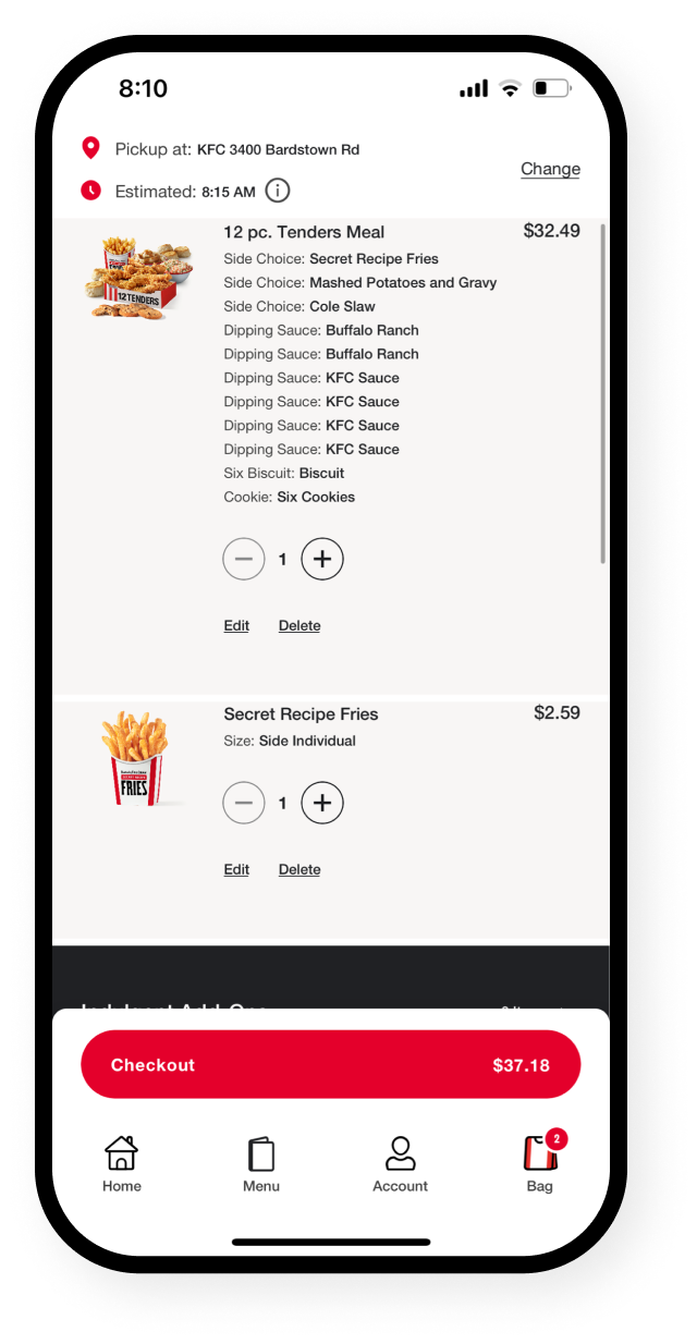
The cart is cumbersome to scroll through and difficult for a user to know the quantity of sides or sauces
After

Redesign the bag page to minimize height of Bag Item Rows so that when possible the add-ons is above the fold.

Simplify the checkout process.

Allow users to still edit necessary details without leaving the checkout experience.

Throughout the cart and checkout progress, there are various steps a user has to click through making placing an order take multiple steps.
Our approach
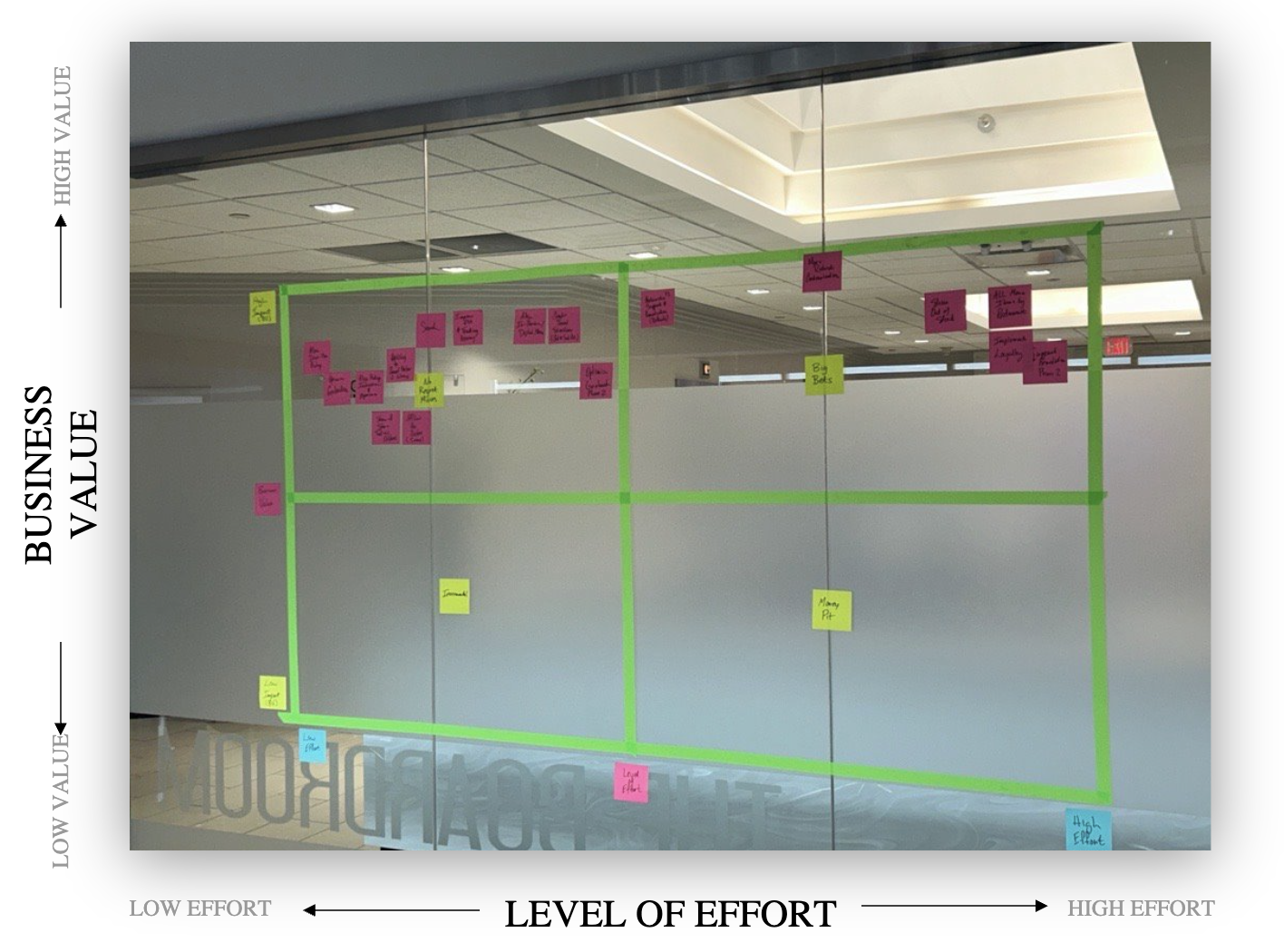
Starting with a discovery phase, we analyzed data on the current experience and conducted user interviews to identify the areas of improvement in the current KFC online ordering experience. Leading the business in a product strategy workshop, we identified the businesses key “No Regret Moves” based on business effort and user impact. We then took our research findings into the implementation phase working closely with a development team to deliver the refactored design improvements that would increase business metrics through an improved user experience.
High Level Process

Current State Analysis
The aim of our analysis was to objectively highlight areas of improvement based on our understanding of UX principles and best practice. Our analysis focused primarily on the KFC app and website.
The biggest hypothesis our team identified was that navigating through both the website and app was cumbersome with important information hidden beneath the fold due to large images and the UX flow of selecting customizations of PDPs (Product Detail Pages).

The old KFC website and app we analyzed.
Competitive Analysis
Following our analysis of the current state of the KFC app and website, in order to propose our recommended solutions for UX refactoring, we wanted to understand what others in the QSR (Quick Service Restaurant) space were doing. This analysis helped us understand what was or wasn’t working in other QSR online ordering experiences and even identify new potential features that could add benefit to KFC users.
Based on our analysis, we have highlighted the competitors that we felt implemented each feature the best.

Screenshot of the summary of our competitive analysis.
User Research

Mapping current user journey


Working board of affinity maps
Research Insights
insight 1
Ordering online doesn’t align with the in-store experience
Users want the choice to be able to order what they normally would when ordering in-restaurant. Users across the board complained about missing menu items that they can order in store and a lack of customization options.
insight 2
The fulfillment process for online orders is inconsistent
Users want to be served in a timely manner and they want exactly what they ordered and paid for. When ordering online there are a plethora of operational issues in getting the orders fulfilled. Orders fulfilled online are inaccurate, items not marked as out of stock online, and store slow to fulfill orders.
insight 3
Experience is lacking value proposition
To retain users, there needs to be an aspect to the experience that entices users to continue to come back to the application. Users desire a curated experience. They want the ability to choose exactly what they want and also see deals and items relevant to them to avoid scrolling through items that don’t interest them.
insight 4
Need for UX improvement across the app & website
One of the main reasons a customer chooses to order online is to make the process more efficient. We want to ensure that users can place an order as quickly as possible with as few clicks and steps as possible. However, the current experience makes selecting a location, browsing the menu, and adding an item to cart cumbersome.
Product strategy workshop with key stakeholders
Following our research findings and analysis of the QSR space through competitive analysis, we took our summary findings and presented all the areas of improvements and new features to consider to the business with the development team.
Leading them through a workshop, we mapped across a 2x2 matrix with business impact and user impact each of the features. Taking into account the technical roadblocks, time to develop, time to design and mapped it across how beneficial the UX feature would be for the user experience.
By the end of the workshop, we identified the “No Regret Moves” that we were ready to move into an implementation phase with.